

We live an age where most people already own a smartphone with Internet access at their fingertips. According to Statista, mobile traffic eclipsed desktop traffic last year to represent over 52% of all worldwide traffic today. In Asia this number is over 65%, which is staggering.
On the other hand, smartphones accounted for 30% ($17.5B) of e-commerce consumer spending in the United States this November through Cyber Monday according to the Adobe Retail Shopping Insights, which collects data from 80 of the top 100 U.S. retailers, including Macy’s, The Home Depot and Best Buy.
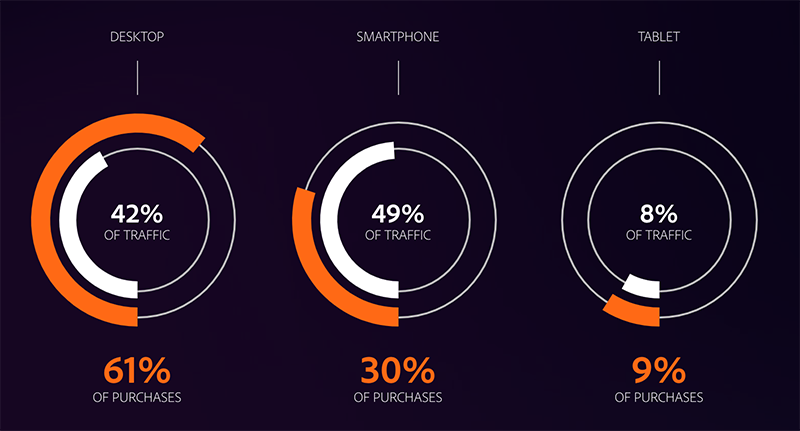 Graphic source: Adobe Retail Shopping Insights
Today, most organizations understand the importance of mobile and invest in responsive web design (RWD) and mobile apps. Many have also adapted a mobile-first strategy that prioritizes the development and optimization of mobile user experiences over desktop.
In this article, we will focus on mobile web and one challenge that still haunts the delivery of such optimal user experience - testing, especially at scale. Most RWD testing remains manual and is performed only when major new functionality is released. Many web teams find it hard to create and, most importantly, maintain trusted automated tests that cover responsive scenarios without the help of dedicated mobile automation testing tools. Thus, many issues with the mobile experience go unnoticed, eroding user trust and resulting in lost revenue.
Let’s explore some approaches to RWD testing and how a solution like mabl can help.
Responsive Web Design Testing Strategies
When devising a mobile web testing strategy, it is best to start by analyzing data from actual usage patterns. For example, data from tools such as Google Analytics can tell us what screen resolutions and browsers are used most to interact with our web app.
If we use Google Analytics, we can look at the Technology (Browser & OS) and Mobile audience reports to determine that, for example, iPhone is top mobile device, and 360px by 640px is the most popular mobile screen resolution. Note that if you don’t have access to your analytics data, you can request an export in CSV or PDF from your web or marketing team.
Armed with data, we can now start working on a plan to test the most common mobile user journeys and scenarios. Here are some questions that might drive the design of our plan:
-
Functional
-
Do all page elements and images appear/resize/disappear as intended at each target resolution?
-
Does navigation function as expected across all viewports?
-
Is the navigation experience intuitive on small view ports?
-
Do all links work?
-
Do interactive elements and forms work as intended?
-
Is it possible to complete all common user journeys within the application?
-
Visual
-
Is the overall visual experience compelling and “on brand” when presented on smaller screens?
-
How can we monitor and detected unwanted visual changes over time?
-
Are navigation and other global elements intuitive when presented in mobile viewports?
-
Performance
-
Are page load times on par (or better) when accessed from a mobile device?
-
Is the mobile experience consistent across the main browsers (e.g. Chrome, Safari, Firefox)?
Answering those questions requires both subjective (e.g. aesthetics) and objective exploration (e.g. state of elements, links, inputs). Of course, this means that you can’t - and shouldn’t - abandon manual testing altogether. Keeping in mind that manual testing is ultimately more expensive than automation in the long run, the goal should be to automate repetitive tedium so that more time can be spent manually testing the parts of your app that really need a human eye. Automated tests also help us ensure an optimal user experience across the plethora of mobile scenarios.
Functional Mobile Testing
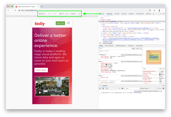
For this type of testing we typically start by performing manual testing using the device emulator in Chrome DevTools. That helps us emulate a responsive experience and validate things work as intended. Here we need to be especially mindful of any page elements that supposed to be hidden. It is also a good practice to test both horizontal and vertical orientations of the device to ensure that the experience doesn’t break as the user fiddles with their phone.
Viewport (Resolution)
We can now set the responsive viewport size to our sample resolution of 360x640 and test what the user experience is like. It is important that the device type is set to Mobile to emulate a touch experience.

Mobile User Agent (Devices)
In addition to setting the viewport, we can choose a specific mobile device, such as iPhone X, to test against. Selecting a device will automatically set the respective viewport and User Agent (UA) string to emulate certain device characteristics.
After doing our initial manual testing we are ready to start automating things with the help of mabl, which makes it easy to create automated tests without scripting. mabl can also auto-heal tests when the UI changes and identify regressions in the user experience, including visual differences and performance anomalies. You can review the mabl overview video to learn more.
mabl Support for Viewport and Mobile User Agents
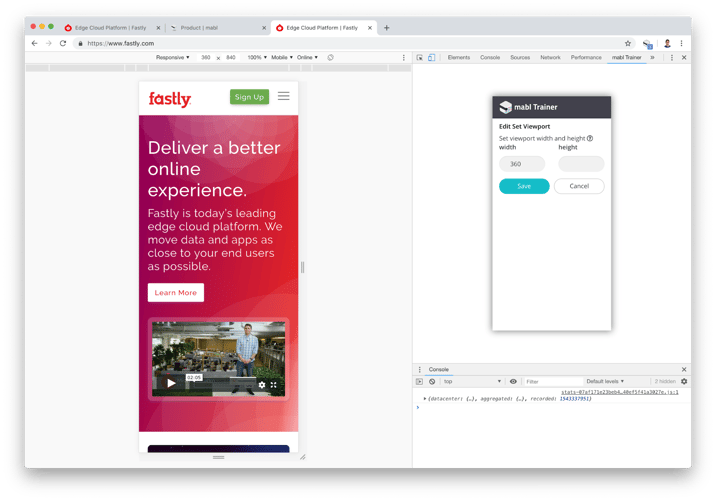
We use the mabl Trainer, a Chrome extension, to train our tests by simply clicking through the web application and making assertions. The tests you train are saved as mabl Journeys, which are run when assigned to a mabl Plan, which specifies the execution environment and schedule among other things.
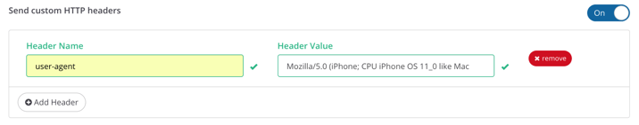
To train mobile web tests, it is best to switch to Device Mode in Chrome DevTools and access the mabl Trainer within the DevTools panel. We can set our test viewport size in the Trainer and specify a mobile user agent in the Plan configuration as shown on the following images.
One productivity hack is to take existing mabl Journeys trained for desktop experience and duplicate them by editing the copied test steps as necessary. Menu navigation and hover steps are something to watch for here. The navigation will most likely be collapsed in a hamburger menu and this will require adding an extra click step to expand it. We also cannot hover over elements with touch input devices so we will need to replace those steps with clicks or custom finds using CSS/XPath selectors. More details about mobile web testing with mabl are available in the documentation.
Visual Mobile Testing
In addition to functional tests, it is valuable to monitor for visual differences in the application over time so that we can identify potential visual regressions such as layout and other element page changes. This is typically done by capturing screenshot images and building a base visual model of the application to compare against. It is very hard to implement a solution that reliably identifies meaningful visual differences among all the noise. This is why most functional test automation tools such as Selenium do not offer such capabilities and require integration with other tools.
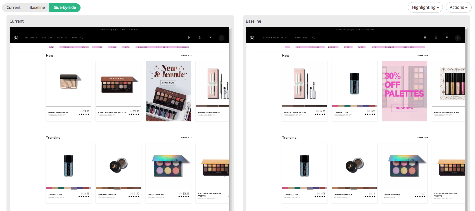
Fortunately, this is another area where mabl delivers on its end-to-end testing solution promise. It uses the captured screenshots to create a base visual model of your application that can differentiate static from dynamic content areas and notify you for important changes. Here’s an example of how mabl highlights visual changes in the application on a side-by-side comparison. You'll notice that only notable changes (the items in the nav menu) are highlighted, while insignificant changes (ads, change in product order), are not.
Check out the blog post on updating visual baselines and models in mabl to learn more about what happens behind the scenes. Now, let’s turn our attention to performance.
Performance Considerations
Load times are very important for the mobile experience where every millisecond counts. The most common issue that most people run into is reusing the same high resolution images for desktop and just scaling them down for mobile devices. This is an issue because the size of these images is large and it takes time to load them on a mobile internet connection. The best way to address this is to have multiple versions of the image and serve the respective one based on the device type and resolution. Web development frameworks and content management systems, such as Sitecore, Sitefinity and Adobe Experience Manager, should be able to handle this for you. you can use the mabl to closely examine performance data.
When it comes to performance, we can use mabl to help us identify whether large images or something else is causing performance issues by examining the stack trace data for each step of our test journeys.
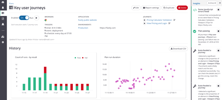
Mabl also keeps a record of test execution times and uses a machine learning model that allows it to predict how long the next execution time should be. If there are discrepancies between what mabl predicted and actual execution time, it will generate a performance anomaly insight for you to review. For example, on the following image image we can see how mabl visualizes Plan runs duration and provides us with insights to the right.
What About You?
How do you test the mobile web experience for your apps? What tools do you use? Do you use any additional strategies? Are there other common issues you run into that I didn’t cover here?
Give mabl a try and let us know what you think.


